
Cyberpunk
I want to call it one of the darkest periods of my artistic experience; which has always been based on positivism. It was the first time I questioned: even the expressions of fear, crying, sadness, anger, or even violence … Were they also worthy of being considered artistic?
The Beauty in Brutalism
The new decade unlocks myriads of incompatible combinations and immersive designs, united into one stylistic family — brutalism. Mark Alan Andre, a famous architectural designer said it once about brutalism in architecture, but it perfectly describes the essence of the concept in digital design too:
“I’m drawn to brutalism because of its simplicity and honesty to its materials. It’s a very “pure” form of architecture when it’s done well.”
This style is about brutal honesty without excessive decorations. It is characterized by deliberate plainness, crudity, or violence of the imagery. It is almost screaming about breaking the traditional rules.
I imagine what would it mean to live in a society taken over by some political institution.
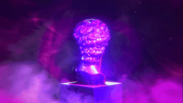
2077- Premonitions
Kim Jong-un
Theresa May
Bill Gates
Cyberpunk Renaissance
“Science fiction is reality ahead of schedule.” — Syd Mead, Blade Runner concept designer

We can describe cyberpunk with nearly the same words since it’s a sci-fi sub-genre. It’s not easy to give a precise definition of cyberpunk.
This concept rooted in the new wave science fiction movement of the 1960s and 1970s and spanned film, fashion, and design industries. It is both a style in digital design and a massive culture. Cyberpunk features advanced science and technology in the future urban world. When you think of cyberpunk, you usually envision incredibly high skyscrapers, shimmering neon lights, futuristic color palette, and dystopian backdrops.
This style has become slightly kitsch in the digital illustration and motion design trends on the edge of millennials, but in 2020, it has gained a second life. Take your sunglasses and enjoy the dazzling and breathtaking blast from the past in the cyberpunk design examples provided below.
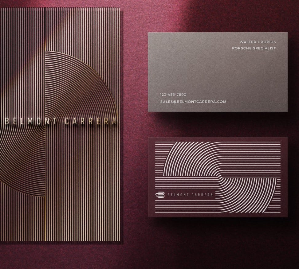
Ultra-Thin Geometry
“The line is a rich metaphor for the artist. It denotes not only boundary, edge or contour, but is an agent for location, energy, and growth. It is literally movement and change — life itself.” – Lance Esplund

In the attempts to create new futuristic aesthetics, designers combine ultra-thin geometry with flowing liquid curves. This incredible mix of styles attracts many companies that incorporate these breezing aesthetics into their branding styles and visual materials. Below, you can see a few samples of the ultra-thin geometry implemented in ultra-beautiful designs, breathing with elegance and minimalism.
When we think of a form, the first thing we see is a line, defining the overall silhouette. The shape and nature of the object live in the line. It is the primary element of every image. This year, we can see the art of line in a very extraordinary form — ultra-thin geometry. It has already gained widespread acceptance in the electronic, industrial, and computer industries. However, in 2020, this style is gaining momentum in graphic design too.


Loud Bold Typography
“Be bold, proclaim it everywhere: They only live who dare.”- Voltaire
In recent years, bold typography has become a big trend. Saying “big,” we mean that it is literally gigantic. Just look at this huge typography below!
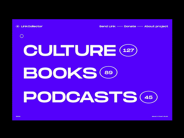

If used in the right place and the right quantity, bold typography has the potential to uncover the brand’s soul, character, and mood. There are a few designers and entrepreneurs who are ready to apply this outrageous font style to brand identity. But, a sensei of typography who knows how to combine bold letters, colors, and digital design in a visual perfection, can bring a lot of popularity to a brand and admiration among a target audience.

Absolute Monochrome
“Color provokes a psychic vibration. Color hides a power still unknown but real, which acts on every part of the human body.” — Wassily Kandinsky
Mono-mania obeys the hearts of many designers, brands, and customers worldwide. The monochromatic color palette has become widely adopted in the digital world. Today, we can see it in website design, mobile app design, branding, and other areas of design. It refers to the use of varying tones of a single color. It is versatile, timeless, refreshing, and easy to style.
Even though a monochromatic coloring operates around different hues of the same color, it looks much more exciting and unusual than plenty of other more “colorful” designs. Of course, the designer should be a real master to choose a tone combination that doesn’t look boring and, on the contrary, it evokes a lot of interest and visual satisfaction.
The particular value of monochrome is hidden in the ability to focus the viewer’s attention on the key elements in the content. It doesn’t distract with unnecessary details or switching colors. Monochrome brings the person’s high concentration on a promoted product or service.


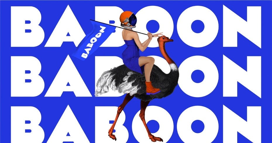
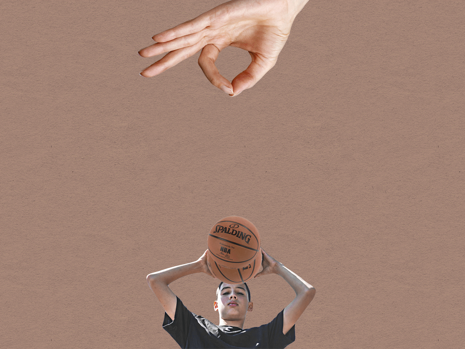
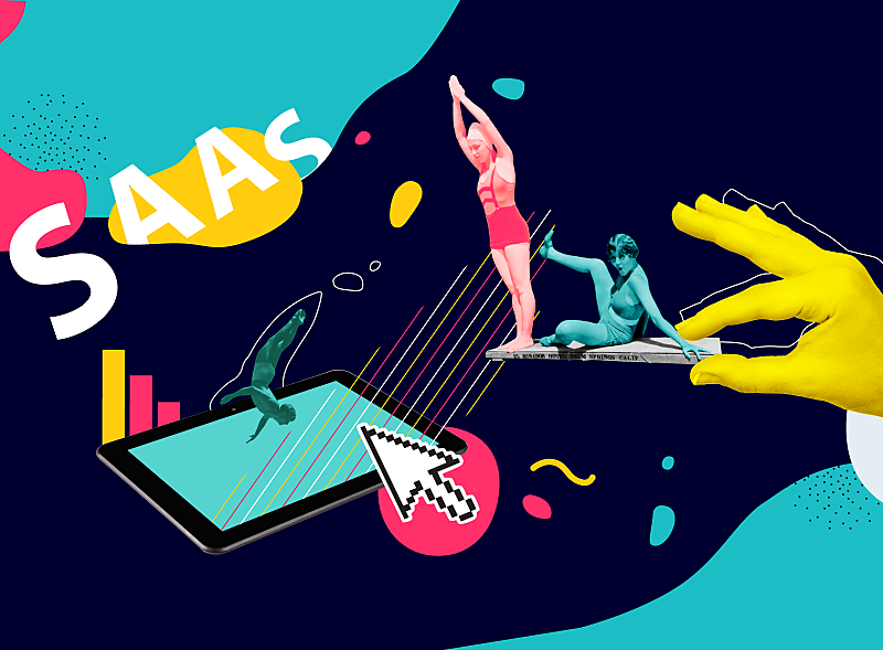
Mind-Blowing Art Collages

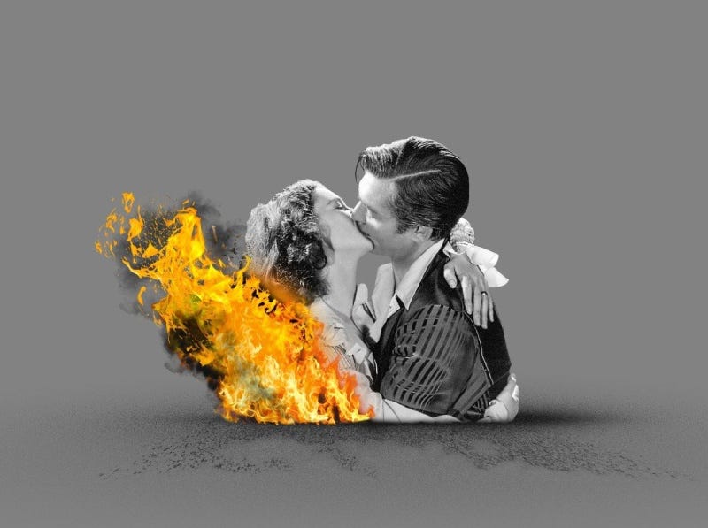
The art collage has become very popular in digital design during the last few years. It is an extraordinary visualization technique that implies an assemblage of different forms, materials, and sources, creating a new whole. It usually includes newspaper or magazine clippings, ribbons, bits of colored or hand-made papers, and photographs glued or photoshopped together on the canvas.
In collages, designers mix the worlds, the universes, and different angles of views on the same topics. They often try to create interesting visual effects tricking the eye and mind. The collage is one cohesive image constituted by several realities. Would you like to see what we really mean? Welcome to a few mind-blowing worlds introduced in these art collages.


Not Saying Goodbye
“If I had asked the public what they wanted, they would have said a faster horse.”- Henry Ford, Founder of Ford Motor Company

The functionality is the horse. One of the designer’s primary tasks is to endow this horse with a silver horn and airy wings. Besides the functionality, we also need a visually stunning design that inspires and lets our imagination fly high. Hopefully, these graphic design examples will help you give a fresh update to your art and empower you to do new creative experiments. Let’s move this world forward to innovation and unconventional beauty!